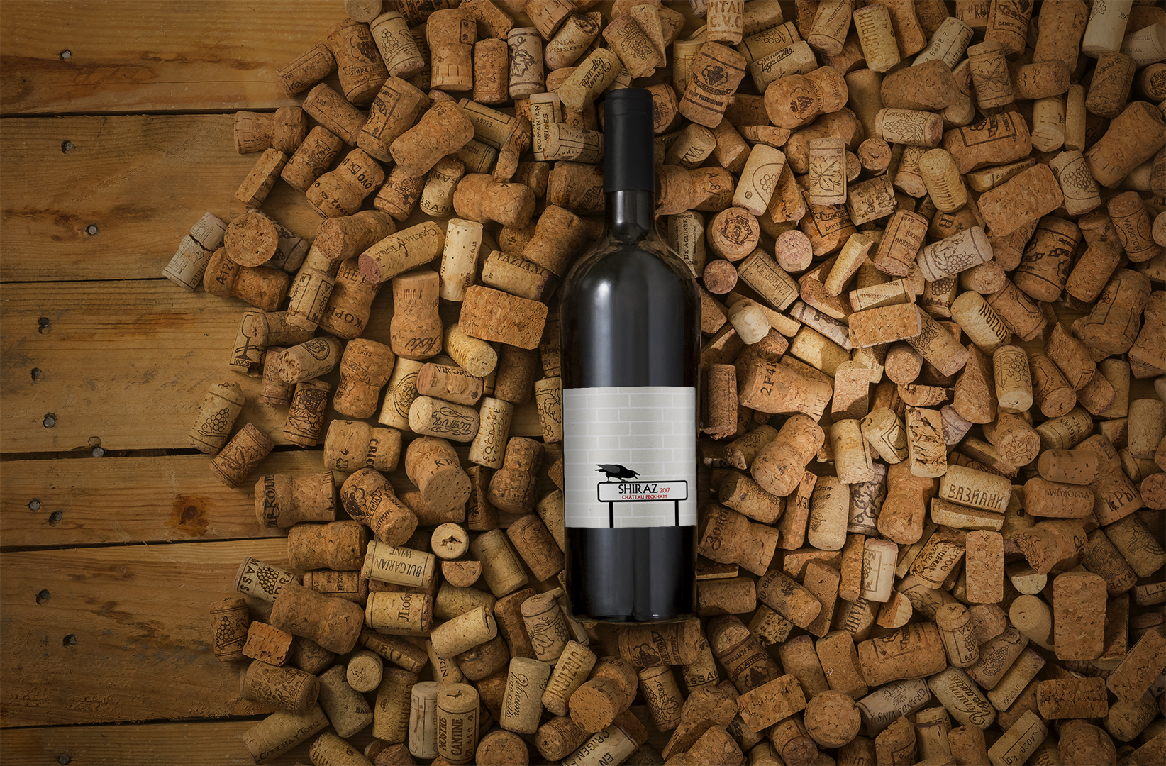
Having successfully bottled the first vintage of Château Peckham, the bottles needed labelling.
Need
Already boasting an irreverent, tongue-in-cheek name that recalls Peckham’s most famous export, the TV comedy Only Fools and Horses (actually filmed in Bristol), the wine needed a label to match this not-totally-serious style.
Solution
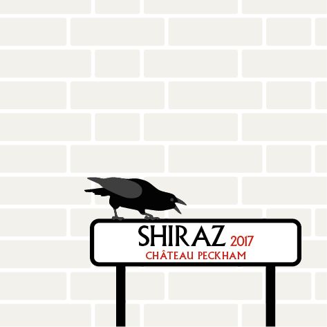
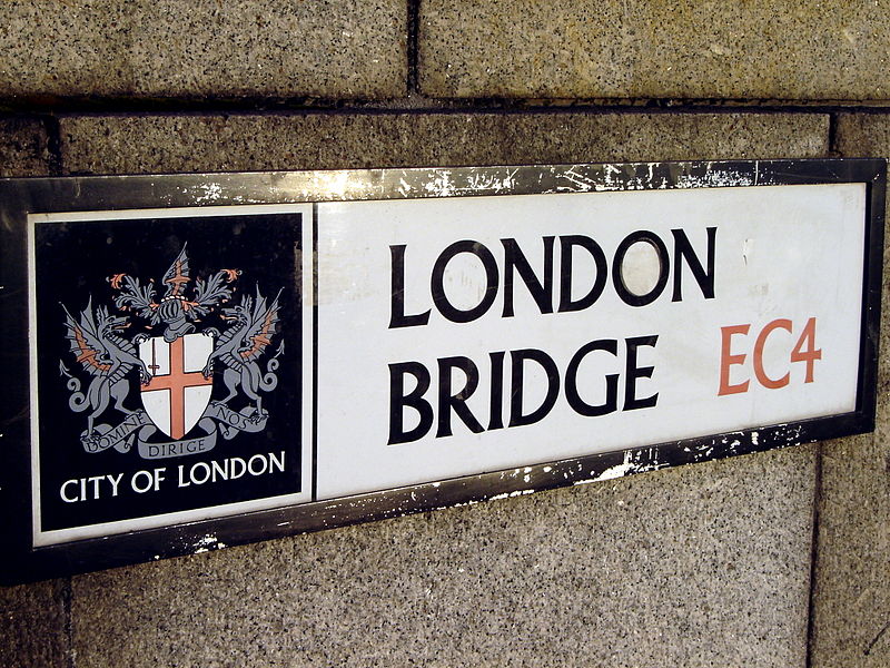
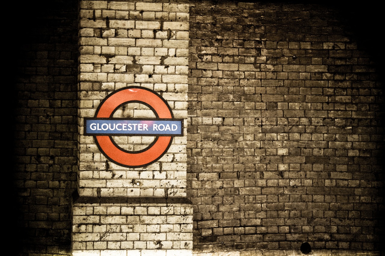
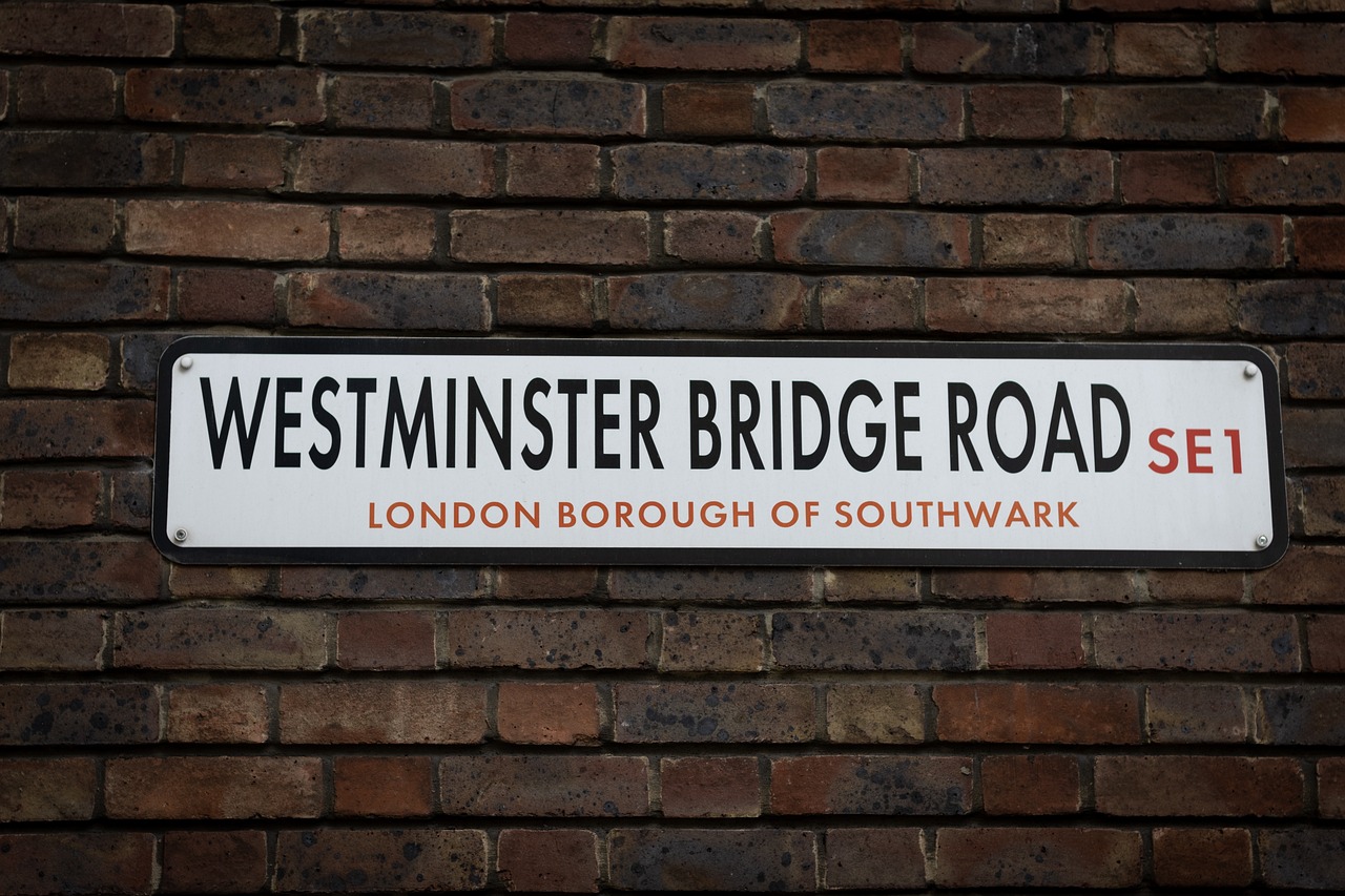
I took my inspiration from features of the local area and of wider London, drawing on the styles of street signs, traditional brickwork, and an iconic Peckham billboard.

I sketched a stylised crow, experimented with different typefaces and layouts, and considered a die-cut outline for the label, with the crow squawking the brand name.
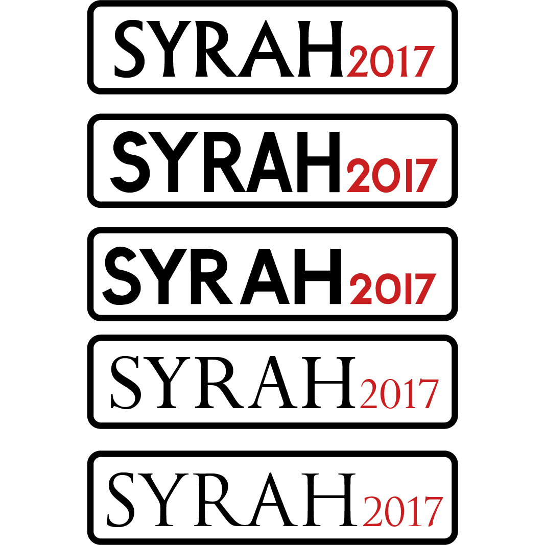
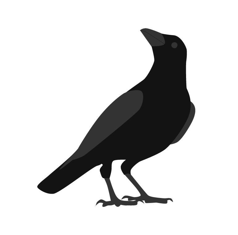
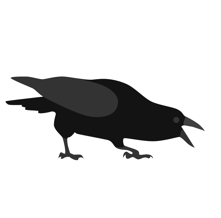
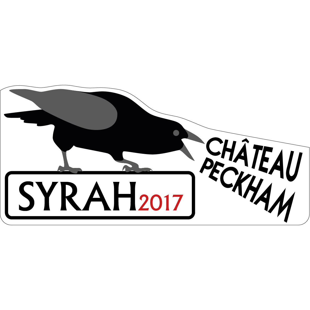
While fun, I felt this design strayed too far from the vernacular of wine labels, while bordering on the cartoon-y. Paring it back a little, I added a brickwork backing and took a more conventional approach with the brand name, retaining the sense of fun but adding a layer of professionalism.