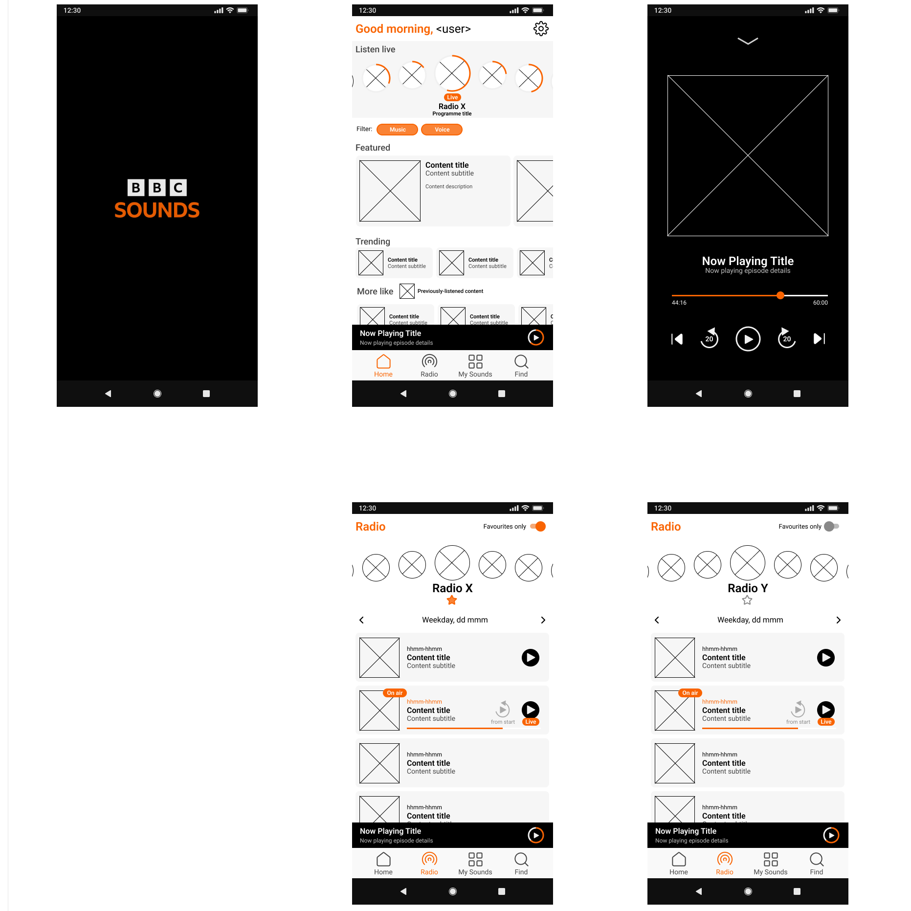
I am a frequent listener to podcasts and radio shows, and the BBC produces some of my favourites. Unfortunately the user experience offered by the BBC Sounds app sometimes leaves a bit to be desired. As an unsolicited UX exercise, I conducted the initial stages of a redesign, from user research through to prototyping: were this a real project, the next stage would be to begin testing.
Need
Although I had my own impressions as a user of the app, I turned to review data to analyse the sentiment of the wider user base and identify pain points. I used Python to scrape 2,000 reviews from the Google Play app store, using the reviewer-assigned score to provide one view of sentiment, and a natural language processing (NLP) library to independently score sentiment based on the text of each review.
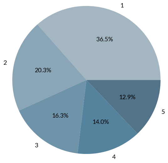
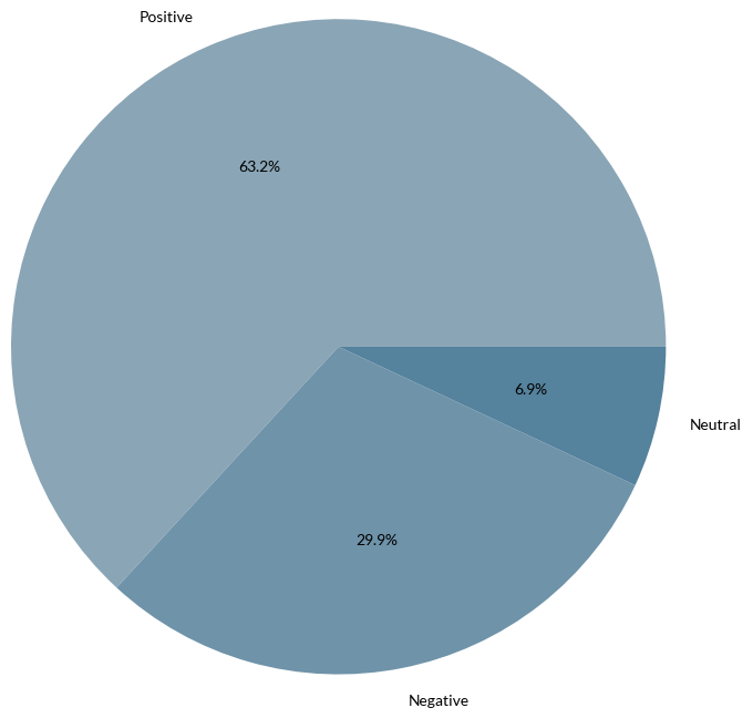
The NLP-based scoring shows a substantially more favourable sentiment than the reviewer-assigned scores. Analysing the most frequently-used words in reviews began to explain this mismatch, and an in-depth look at a small sample of reviews confirmed that reviewers had very positive things to say about the content available through the app, but negative comments about the app itself. It seemed likely that many of the low-scoring reviews were being classified as positive because of the appreciation shown for the content. This supports the need to refine the user experience: currently users are enjoying content in spite of the app’s problems, but there is significant room for improvement.
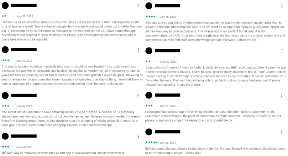
Particular pain points that reviewers highlighted were the limited ability to customize the content being shown, the difficulty of finding content to listen to (either through recommendations or via a search or browse mechanism), an overly-complicated experience for radio listening through the app, and some technical issues with streaming content. All but the last of these pain points could be addressed through changes to the interface, and the problems reported when browsing for content may also indicate a need to revisit the hierarchical categorisation of content.
Although not specifically cited by a significant number of reviewers, it seems likely that the large volume of content offered by the BBC through the Sounds app is a contributing factor. The app must cater for a range of types of content, leading to a complex interface. The diagram below shows some of the main screens in the app. It is clear that some screens offer overlapping views of the content offered, and some useful features are difficult to find, or else missing.

Solution
I formulated a list of user jobs to be done for selected parts of the app, seeking to address the pain points identified, and adjusted the interface design in response. The results of this after a couple of iterations, first as sketch models and then using Figma, are set out below.
Home
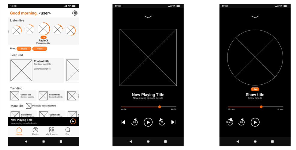
Jobs: On entering the app, a user may wish to continue listening to part-finished content, discover new content they may enjoy, listen to live radio or past radio programmes, listen to the latest episodes of favourite shows, or find something by searching or browsing.
Design response: I simplified the bottom navigation bar to more closely align with these jobs; retained the ‘now playing’ banner section to allow the user to continue a previously-playing show and refocussed the home page to better serve content discovery.
Radio
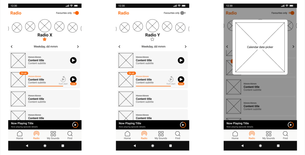
Jobs: The user may wish to listen to live radio or find a past programme in the schedule, selecting from a shortlist of favourite stations.
Design response: I added a simple mechanism to select favourite radio stations and to toggle between display of all stations or only favourites. I also adjusted how live shows were displayed within the schedule. A more significant redesign might move away from the schedule paradigm as the default display for each station: my user research had offered no evidence whether this was helpful or not, so testing would be needed.
User page
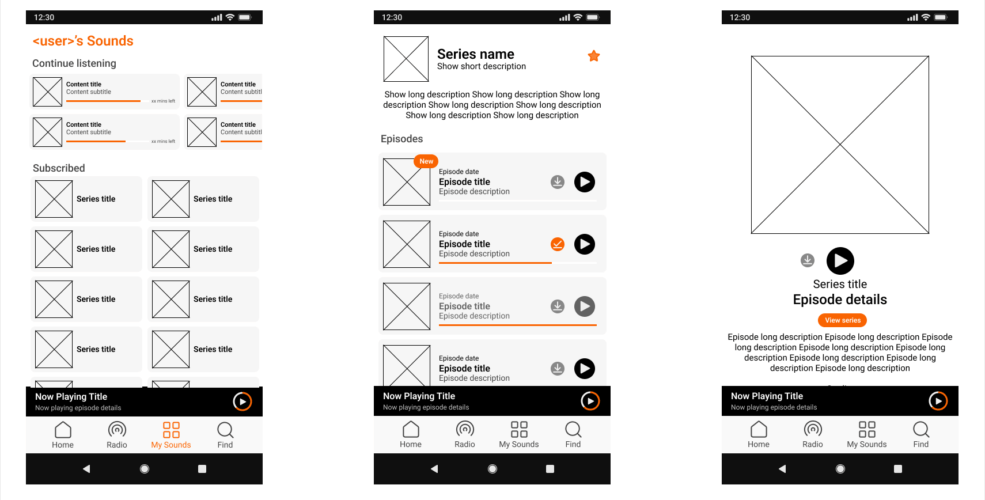
Jobs: View and select from the latest releases from subscribed shows or podcasts.
Design response: I simplified the display of user favourites to a basic feed of shows (as opposed to episodes), with filters available to aid in finding content within this feed. The focus on shows reduces clutter, and partially addresses the desire expressed by one of the highlighted reviews above to have a mechanism for removing episodes from a feed but without creating another, hidden interaction to learn.
Find
Jobs: Search for content, or browse via a hierarchical structure.
Design response: I added colour to the display of genres and categories in the ‘Find’ screen, helping distinguish each one from the others. I also rearranged the display of voice and music hierarchies so that the top-level division between music and voice content is visible within the screen without scrolling.
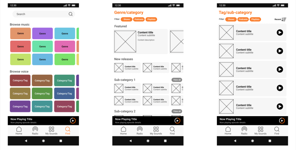
I integrated these individual screens into an interactive prototype that could be used to support an initial round of testing with users. As this was an unsolicited exercise, I did not pursue any testing, however.
