I had developed a concept for a wine education service, Wine with Andy, which would initially take the form of a Youtube channel and associated Instagram account.
Need
So as to ensure effective branding, I needed a strong graphic identity from the start.
Solution
I specified a limited set of brand colours, to provide cohesion: a single colour to use in various tints and shades and a wine-inspired highlight colour. I tested the combination of these colours to ensure adequate contrast for common forms of colour-blindness. I then began exploring different logo designs, experimenting with different ways of referencing wine or incorporating wine-related iconography.

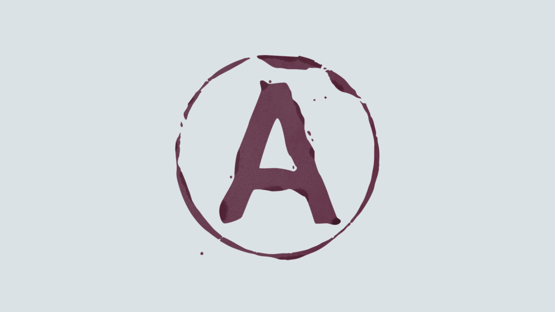
I settled on a design recalling a ring stain from the base of a wine glass, with a capital ‘A’ reminiscent of crude ink printing in the centre. This both afforded the logical incorporation of a colour link to wine and suitably matched the irreverent tone intended for the brand. I developed versions of this logo in both raster format, incorporating texture and some variation in shade, and in vector format, to allow easy use at different scales.
Rather than using the logo as a static splash screen at the beginning of video tutorials, I developed a more visually engaging animation, showing a drop of wine falling on to a surface, soaking in, and drying out to leave the shape of the logo.